
Your Trusted SEO Company for Real Results
SEO.com is the ultimate destination for all things SEO. With a track record of excellence and a team of seasoned experts, SEO.com is your go-to source for optimizing your online presence. From keyword research to content optimization and backlink strategies, trust SEO.com to propel your website to the top of search engine rankings.
Start with our most popular content:
Let’s Drive Results Together
If you’re looking for a trusted SEO company to take your 2024 goals to new heights, we’re ready!
Rank Above Your Competition With These Services
SEO Services
Rank higher for higher quality searches. We’ve ranked thousands of websites over the years. With fully custom SEO services, we’ll get you closer to the top!

Local SEO Services
Capturing foot traffic is just as important as web traffic. Even if your competitors are across the street, appearing in localized search results can get customers in the door.

PPC Services
If you’re itching for quick results and have the budget for pay-per-click ads, you can show up wherever you want! Push your competitors further down page one with PPC.
Digital Marketing
All digital marketing strategies work best when done together. We’ll handle a custom-built, holistic digital marketing campaign for your business!
Find a reliable SEO company perfect for your business
Looking to trust your SEO efforts to the experts? Finding the best agency can be a challenging decision. View our SEO services or read through our guides on this key process.


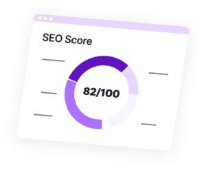
Don’t fail your website’s most important test
Get an SEO scorecard of your website for free in less than 30 seconds.
Learn the fundamentals of SEO
Looking to level up your SEO knowledge? Trying to figure out where to start? You’re at the right place to learn key building blocks of SEO.


Explore insights from SEO experts
Read tips, research, viewpoints and more from the WebFX marketing team and level-up your SEO knowledge.


Who We Are
👋SEO.com is powered by the SEO company, WebFX, a tech-enabled digital marketing solutions provider. Since 1995, we’ve partnered with thousands of companies to help them grow their business through the web.
Our team is made up of award-winning marketers, designers, and developers, and we know what it takes to get real results online. We also keep the focus on the metrics that mean the most, like leads and revenue generated. We’ve even built software like Nutshell and MarketingCloudFX for SMBs looking to maximize revenue from organic search traffic.


It’s a big deal to trust your company’s SEO efforts with an agency. It’s a responsibility that we take very seriously.
At WebFX, we align your SEO strategies around your business goals. SEO is a part of the bigger strategies you have in place to grow. We take the time to get to know and understand your business, your industry, your competition, and how you go to market.
Our commitment to a deep partnership with our clients combined with our expertise gives you a huge advantage over your competitors. We’ve been at the SEO game since the 90s and have launched and analyzed over 10,000 campaigns. When you partner with WebFX, you’re getting a team of proven experts with experience in your industry.
Still not sure? Let’s talk data. Your marketing data. Your sales data. Competitive intelligence data. Industry forecasts. We put all of it to work for your business. Each recommendation we make is based on mountains of data. Our team has also worked to develop proprietary tools that help us more effectively build strategies, track and report our results, and the #1 ROI tracking platform in the industry, called MarketingCloudFX.
The web is our passion, and we’re passionate about helping businesses reach their goals. So when you choose WebFX as your SEO company, you won’t get a cookie-cutter strategy — you’ll get a custom plan that challenges your business and pushes you closer to your goals.
Helping Businesses Grow For 25+ Years
260%
INCREASE IN ORGANIC REVENUE
31%
INCREASE IN LEADS FROM SEO

670%
INCREASE IN PPC LEADS

948%
INCREASE IN WEB VISITS FROM EMAIL
Let’s Drive Results Together
Connect with WebFX to get a custom SEO strategy for your business.


