


Over the past few years, Google has drawn a lot more attention toward mobile SEO, and rightfully so, considering 58% of Google searches come from smartphones. Not to mention, they offer better opportunities for rankings, user experience, and click-through rates (CTR).
Still, you only get these benefits if you implement mobile SEO effectively. In this guide, we explore why mobile SEO is important and walk through a 15-step mobile SEO action plan to get your strategy moving.
In this guide:
- What is Mobile SEO?
- Why Mobile SEO is Important
- Mobile SEO Foundational Considerations
- Performance and User Experience (UX)
- Mobile Content and On-page Optimization
- Mobile SERP and Keyword Strategy
What is mobile SEO?
Mobile SEO is the practice of optimizing your website to rank higher in search engine results pages (SERPs) for users on mobile devices, such as tablets and smartphones.
This practice aims to tailor content, site design, structure, and performance to provide a more seamless user experience on smaller screens.
Why mobile SEO is important
With 58% of Google searches now coming from smartphones, mobile SEO is growing more than ever.
For this reason, Google has adjusted its algorithm to focus more on mobile search with mobile-first indexing. This means that Google primarily considers the mobile version of your website when indexing and ranking it.
Additionally, 61% of users are more likely to buy from a mobile-friendly website, and 76% of those searching on smartphones visit at least one business within a day. These statistics show that your site’s mobile-friendliness can have a direct impact on product sales.
Prioritizing mobile search optimization can help you connect with customers through a better user experience.
Mobile SEO foundational considerations
When implementing mobile SEO, you need to complete the following four steps before you can focus on any other aspect of mobile SEO optimization.
- Choose a preferred way to configure your website for mobile
- Set a viewport meta tag
- Let Google crawl everything
- Consider mobile-first indexing requirements and ensure content parity
1. Choose a preferred way to configure your website for mobile
There are three main ways to configure your site for mobile:
Responsive design
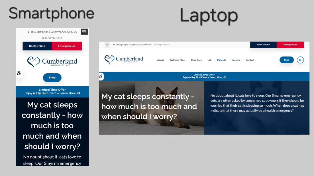
Google recommends this configuration method, which is the easiest to implement and maintain. It rearranges the elements on a given page to fit the screen where that page is displayed, allowing your page to respond appropriately based on whether a user is accessing it from a desktop or a mobile device.
All your content will come from a single URL, use the same HTML code, and simply adjust the CSS based on a user’s device.
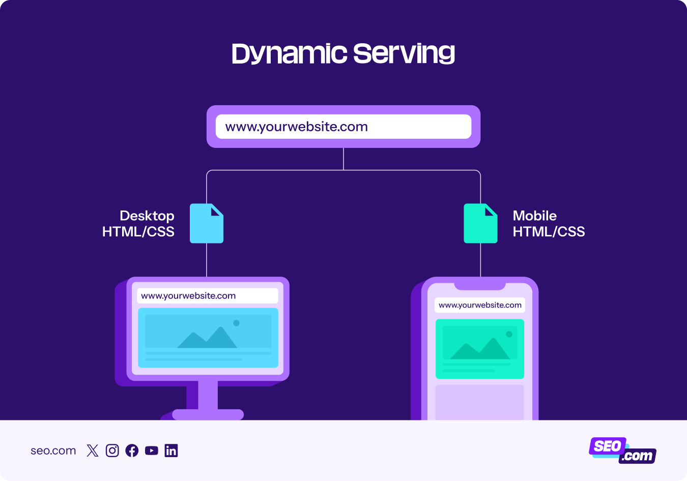
Dynamic serving
Dynamic serving uses the same URL, but shows each user different HTML and CSS based on the device they’re using. This method is often not recommended due to its frequent issues.
For instance, sometimes the server may send the desktop version to mobile users. You’ll also need to create different versions for each new type of device that comes out.
Separate mobile URL
The separate URL method, also called the “M.” configuration, creates a separate mobile version of your website. This URL typically looks like “m.website.com” instead of “www.website.com” whenever a visitor accesses the site via a mobile device.

This is the least recommended method, given that it is time-consuming to manage with different tags for each HTML code.
🏅Recommended configuration method: Responsive design
The result? Automatic adjustment of layout and functionality for mobile devices.
2. Set a viewport meta tag
If you’re going to use a responsive design, you need to set up a viewport meta tag. The viewport determines the width of the page based on the user’s device. It often looks like this:
<meta name=viewport content=”width=device-width, initial-scale=1”>
Forgetting to add this tag could show the desktop version to a smartphone user.
🏅Recommended action: Set up your viewport meta tag like this: <meta name=viewport content=”width=device-width, initial-scale=1”>
The result? Visitors with different devices get the correct page size based on their device.
3. Let Google crawl everything
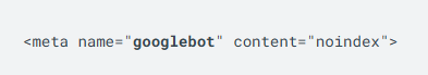
Avoid blocking Googlebot from accessing assets like JavaScript, CSS, and HTML. Allowing Google to crawl your pages will enable it to examine whether your site is mobile-friendly and how each page should rank.
You can see if your website is blocking any resources through Google Search Console. Here, you can check your robots.txt file for any areas that block Googlebot from crawling or indexing certain parts of your website.
You’ll know they’re blocked from certain areas of your website when they have this tag:
🏅Recommended action: Remove disallow prompts from your robots.txt file.
The result? Google will be able to recognize your efforts to make your site mobile-friendly, and it will rank your content appropriately.
4. Consider mobile-first indexing requirements and ensure content parity
Complying with Google’s mobile-first index is another non-negotiable mobile SEO factor. Google’s mobile-first indexing means the mobile version of your site is the version that Google looks at when indexing and ranking it.
For this reason, you’ll want to ensure content parity and consistency across your mobile and desktop website versions. In other words, you don’t want to hide any important content from the mobile version. Here are some general best practices:
- Allow mobile versions to match desktop content exactly.
- Use identical schema markups.
- Maintain the same link structure with both versions.
- Keep consistent heading tags throughout articles for both versions.
- Use the same titles and meta descriptions for mobile and desktop versions.
🏅Recommended action: Make sure your site’s mobile version matches the desktop version exactly.
The result? Google will be able to index and rank your site appropriately.
Performance and user experience (UX)
Once you’ve taken care of the foundational factors, you can move on to improving the performance and user experience of your site for mobile users. Your main focus should be on making the site fast and easy to navigate.
1. Boost your mobile page speed
Google research shows that 53% of mobile users leave a mobile site if it takes longer than three seconds to load. For this reason, Google recommends improving your mobile page speed to beat this time.
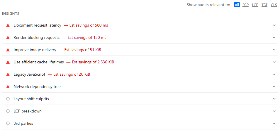
You can check your page speed through Google’s PageSpeed Insights tool. This tool allows you to check your website’s mobile page speed and provides valuable recommendations for improving mobile page speed.
Here are a few more key mobile speed optimization tips you can implement if you haven’t already:
- Optimize images and videos by using the format WebP to shrink file sizes without lowering quality.
- Apply lazy loading to images further down on the page to reduce the initial load time.
- Optimize your code by removing unused code, loading above-the-fold content first, deferring non-essential JavaScript, and minifying HTML, CSS, and JavaScript.
- Speed up server response times by using a Content Delivery Network (CDN), caching static resources, minimizing database queries, and enabling Gzip or Brotli compression.
- Make mobile-specific adjustments by using responsive ads with lazy loading, making adjustments for different network speeds, and removing resource-heavy elements like animations and sliders.
🏅Recommended action: Use Google’s PageSpeed Insights tool to get mobile page speed improvement suggestions.
The result? A lower bounce rate from mobile users, lowering the impact on page rankings.
2. Optimize Interaction to Next Paint (INP)
Interaction to Next Paint (INP), the replacement for First Input Delay (FID), measures how quickly your site responds to user interactions.
Rather than simply measuring that first interaction between a user and your site like FID does, INP monitors the responsiveness of your website throughout the lifespan of your page.
For example, let’s say you have too much lazy-loading content that loads while the user is scrolling. If your site is too busy loading this content when the user clicks on a link, it may take longer to load the result of the link. This can directly impact and lower your INP score.
The goal is to get an INP score of 200ms, which indicates good responsiveness. You can check your INP score on Google PageSpeed Insights, along with some suggestions for improvement.
Some common issues with INP scores often relate to long JavaScript tasks, inefficient event callbacks, and large HTML Document Object Model (DOM) sizes. Here are a few things you can do to handle it:
- Break up JavaScript tasks with a scheduler API. This will allow it to check on user needs between smaller tasks to avoid making the user wait too long.
- When someone uses the site’s search bar, enable your site to run a search only once the user has stopped typing or once every half second, instead of running a search for every letter the user types.
- Avoid adding unnecessary code and overly complex layouts to page builders to help the HTML load faster.
🏅Recommended action: Check your INP score and immediate issues on Google PageSpeed Insights to get a look at the inefficiencies you need to solve.
The result? A faster loading page that enhances the user experience.
3. Optimize font and tap targets
You can optimize your mobile site for better readability by making the font big, bold, and legible. The font should be anywhere between 14px and 16px.
You also want to choose appropriate navigation styles that are thumb-friendly. To do this, your touch targets should be around 48 pixels in size, with interactive elements around 32 pixels apart.
It’s also helpful to place key navigation options in the bottom half of the screen for easy access. You can also use a hamburger menu to save screen space. Whatever your choice, just make sure your navigation options are limited to 4–8 items. Expandable sections will help you organize related content.
🏅Recommended action: Choose font and navigation styles that are thumb-friendly to enhance the user experience.
The result? User-friendly navigation that increases mobile user session duration and reduces bounce rates.
4. Add white space
Add ample white space or “negative” space. This is the space between text blocks, buttons, margins, and design elements. You want the white space to declutter your page and make content easy to follow.
Here’s an example of a page that uses white space effectively:
🏅Recommended action: Add enough white space around text blocks, design elements, margins, and buttons.
The result? Enhanced readability that leads to longer dwell time and a lower bounce rate.
5. Use mobile-friendly pop-ups
Because Google’s main goal is to provide users with great content, it discourages intrusive pop-ups on mobile sites. This especially applies to interstitial pop-ups that cover the main content as soon as the page loads.
Here are three examples of intrusive pop-ups to avoid.
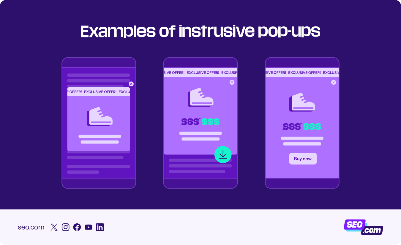
- Intrusive pop-up #1: This pop-up is intrusive because it takes up the middle of the screen and blurs out the background.
- Intrusive pop-up #2: This one takes up most of the screen while providing a price offer along with a downloadable asset.
- Intrusive pop-up #3: This pop-up covers the entire screen and encourages the user to make a purchase.
Now, here are a few examples of acceptable pop-ups for your site:
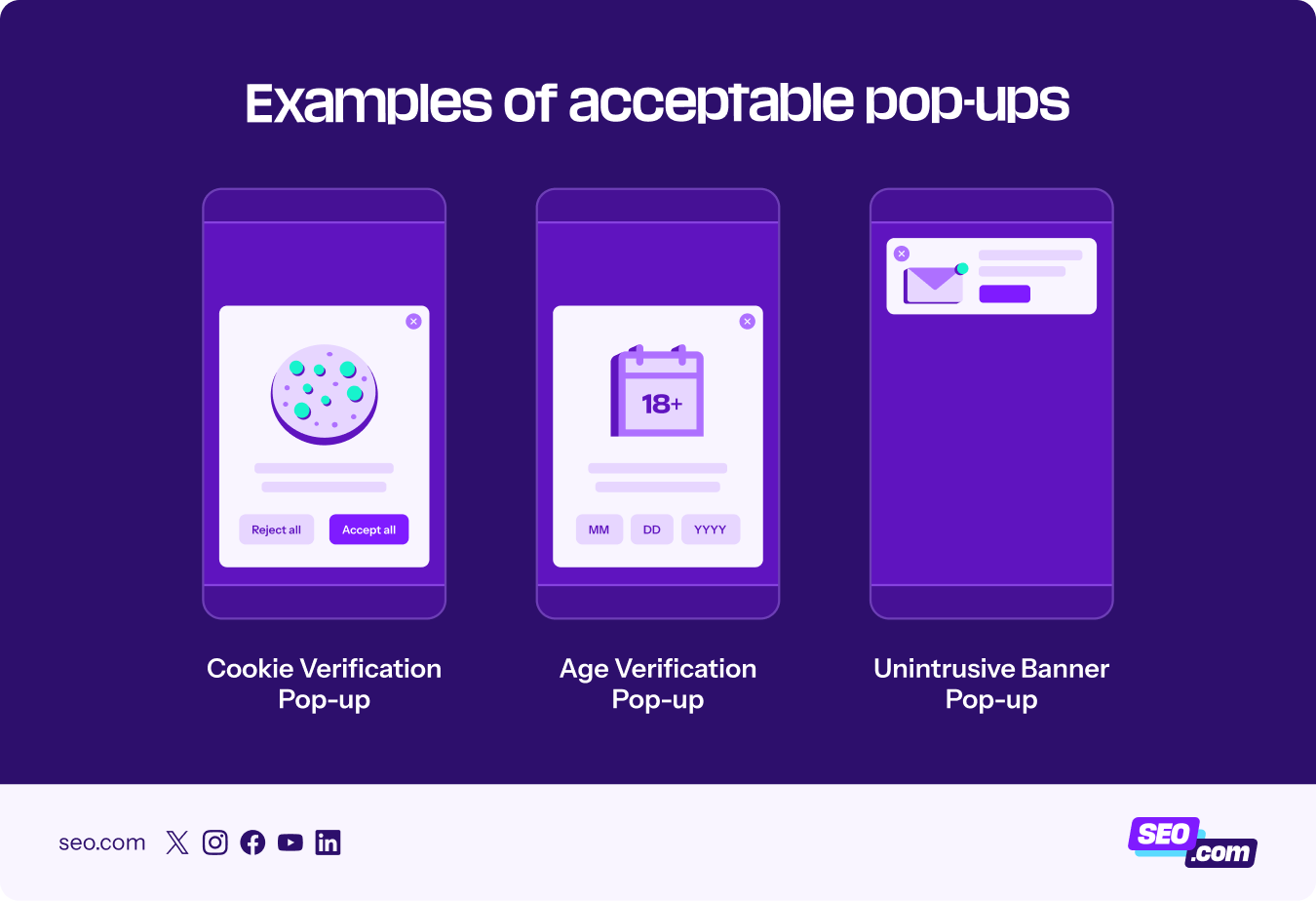
- Acceptable pop-up #1: This is a cookie verification pop-up that gives users valuable insight into how their information will be used.
- Acceptable pop-up #2: This is an age verification pop-up that can be useful for sites that aim to offer age-appropriate content.
- Acceptable pop-up #3: This is a great example of an unintrusive banner pop-up that still displays most of the above-the-fold content.
🏅Recommended action: Adjust your mobile pop-ups to avoid covering above-the-fold content unless it is necessary to include an age or cookie verification pop-up.
The result? A lower bounce rate, and your site won’t get penalized!
Mobile content and on-page optimization
After managing core website functionality for mobile users, you want to make the actual content on your pages easy for users to consume. Here are a few key practices to help you do that.
1. Write short paragraphs and introductions
Your paragraphs are likely going to take up more space on mobile pages compared to their desktop versions. To avoid overwhelming the reader, include only a single idea in one paragraph and ensure that the paragraph is no more than 2–3 lines.
It also helps to write shorter introductions that take up less space on a mobile screen. This helps mobile readers to get to the main content earlier, enabling them to get the answers they need sooner.
🏅Recommended action: Write paragraphs that are 2–3 lines long and write a 1-paragraph introduction to get to the point fast.
The result? Enhanced readability, user experience, and dwell time.
2. Add mobile-friendly visual content
Optimize your images and videos to enhance the user experience, not hinder it. Make sure that your header image doesn’t take up the entire screen, but only a portion of it.
Some mobile SEO best practices include using responsive images, compressing them with WebP, and incorporating lazy loading. You can also incorporate high-contrast colors into videos and images to improve readability.
🏅Recommended action: Optimize your images and videos for mobile by compressing them, implementing lazy loading, and using responsive designs.
The result? Enhanced user engagement and faster page speed.
3. Optimize for voice search
Research finds that 40% of adults use voice search daily. People using mobile devices for search can often use voice search to get the information they need right away or while they’re on the go.
Voice search users tend to rely on more conversational search queries, so it’s important to incorporate more long-tail, question-based keywords into your keyword strategy.
These keywords will help you gain more AI search visibility. Soovle is a valuable and free keyword research tool you can use to find long-tail keyword suggestions to get you started.
To improve voice search optimization, you should also try to include the most important information in the first paragraph of your article sections.
🏅Recommended action: Use Soovle to find and incorporate more long-tail, question-based keywords into your content.
The result? Higher AI visibility among mobile voice search users.
4. Use schema structured data
Schema markup (or structured data) is a piece of code that you add to your HTML that tells Google and AI systems the format and type of information that your page provides. This helps them rank your content appropriately.
Structured data is especially helpful for mobile SEO rankings if you want your content to rank with relevant display elements and rich snippets, such as reviews, recipe ratings, or listings.
This blog post on schema markup is a great, detailed resource for learning how to add structured data to your pages.
But if you’re looking for a quick answer, you can start implementing structured data by visiting Google’s Structured Data Markup Helper tool. The tool will allow you to generate schema markup types, such as question and answer pages, job postings, book reviews, product listings, articles, datasets, and more. It’ll then help you add your schema markup to your URL.
🏅Recommended action: Use Google’s Structured Data Markup Helper tool to generate and add the relevant schema markup to your HTML and URL.
The result? Your content will feature more rich snippets in the SERPs, such as images, prices, and ratings, encouraging mobile users to click.
Mobile SERP and keyword strategy
By this point, your site and content should be ready to go. But there are a few extra steps you can take to get people to actually click on your pages from the SERPs. Here’s your final, crucial stage for enhancing mobile SEO.
1. Do mobile keyword research
You’ll find that “near me” keywords are more frequent on mobile, making it essential to optimize for local SEO. A recent study revealed that over 1.5 billion searches each month contain “near me.”
You can take your mobile SEO strategy a step further by enhancing your local SEO practices. First, make sure you’ve filled out your Google Business Profile with all the relevant details to rank well.
You should also do an audit on local keywords that rank well or garner more engagement from mobile users. Soovle is also a good tool for seeing your local keyword strategy options.
🏅Recommended action: Create and optimize a local keyword strategy using Soovle and other keyword research tools.
The result? You’ll gain more local visibility among mobile users, allowing you to attract customers fast.
2. Optimize titles and meta descriptions for mobile SERPs
If most of your website’s organic traffic comes from the mobile SERPs, you’ll want to optimize your titles and meta descriptions for better viewing on mobile devices.
This means you should limit your meta descriptions to approximately 155 characters and title tags to approximately 55–60 characters. If you can make them shorter, you’ll reduce the chances of Google rewriting them or cutting them off.
To further improve your title tags and descriptions, frontload the most important information and include one primary keyword instead of keyword stuffing.
🏅Recommended action: Limit title tags to 55–60 characters and limit meta descriptions to 155 characters.
The result? A higher mobile click-through rate (CTR).
Enhance your mobile SEO strategy with professional SEO services
Following this mobile SEO checklist will allow you to gain more visibility across search engines and AI systems.
Don’t have the time or experience to execute these steps? You won’t need to if you work with the experts at SEO.com. Our team of experts is well-versed in mobile SEO strategies and has driven qualified leads for our clients in just the last few years.
Contact our team to learn more about how we can help you build an effective mobile SEO strategy!
SEO Services That Aren’t Cookie Cutter
Get an SEO strategy that’s tailored for your business, industry, and revenue goals.


SEO Services That Aren’t Cookie Cutter
Get an SEO strategy that’s tailored for your business, industry, and revenue goals.
SEO Services That Aren’t Cookie Cutter
Get an SEO strategy that’s tailored for your business, industry, and revenue goals.